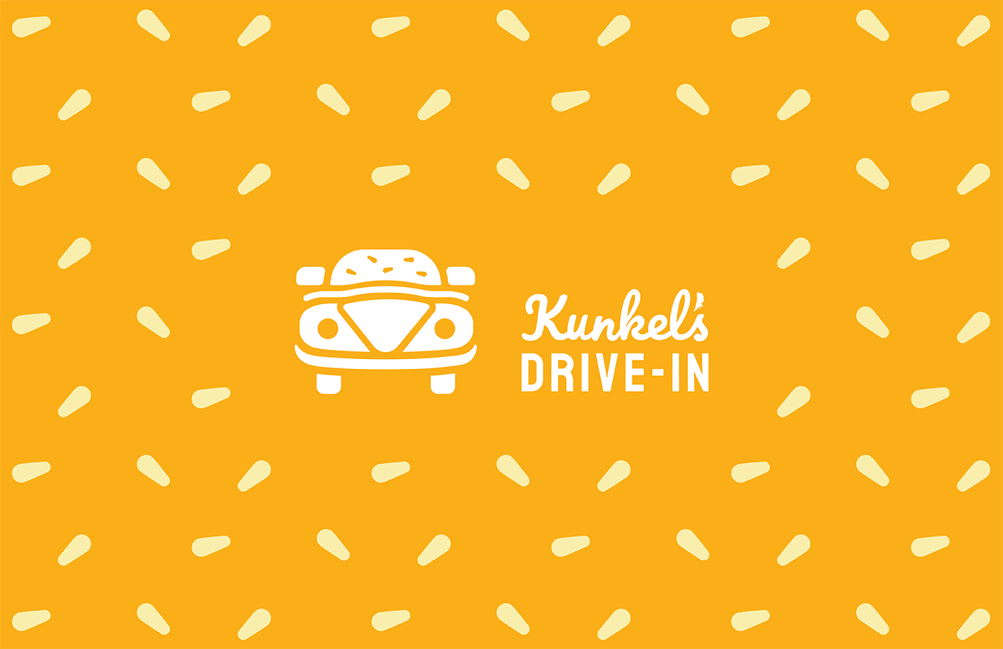
KUNKEL’S DRIVE-IN
Identity Design, Food truck, Packaging, Menu Engineering
LOCATION: Muncie, IN
ROLE: Designer
AWARDS: Packaging of the World
OVERVIEW:
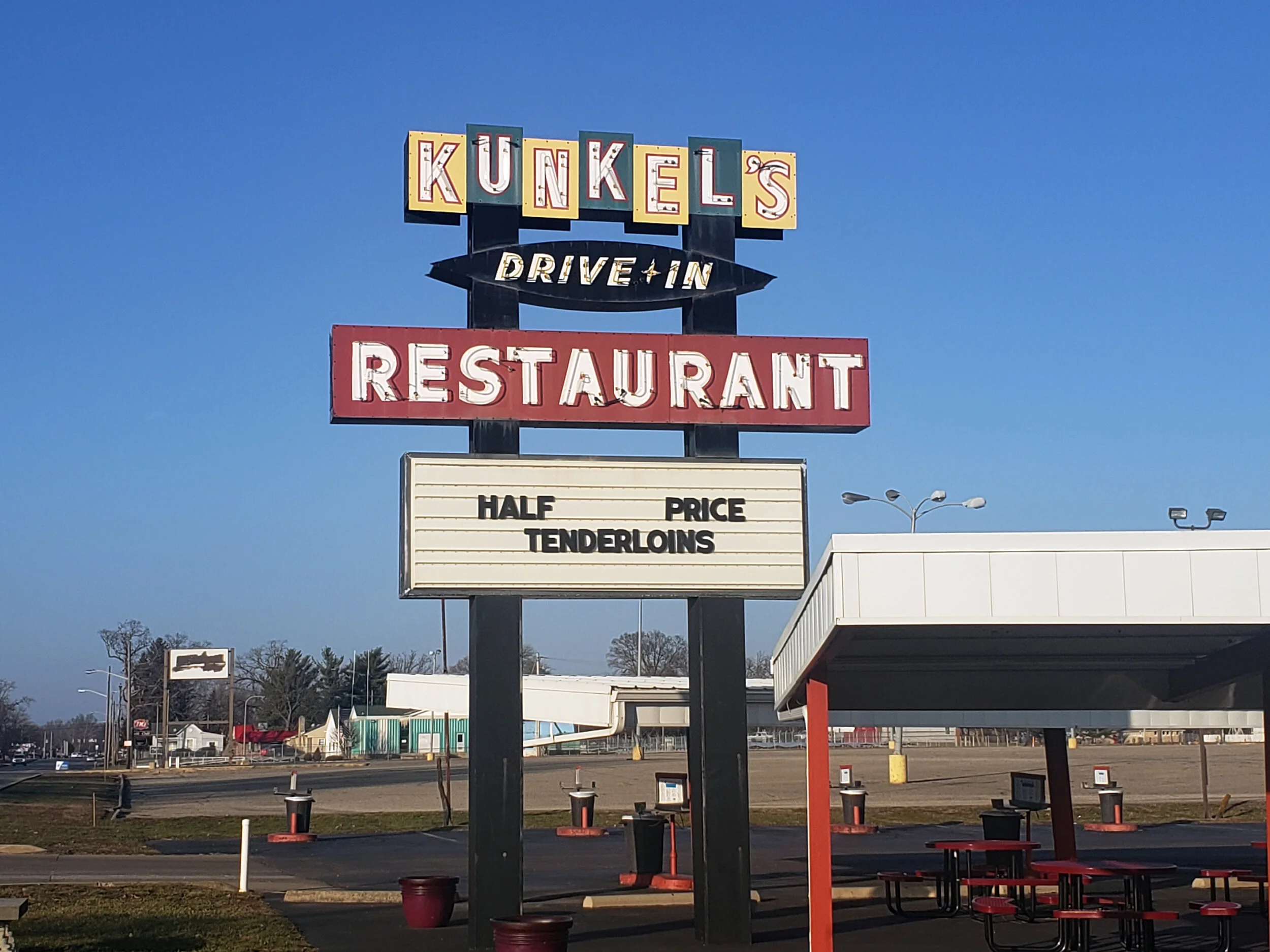
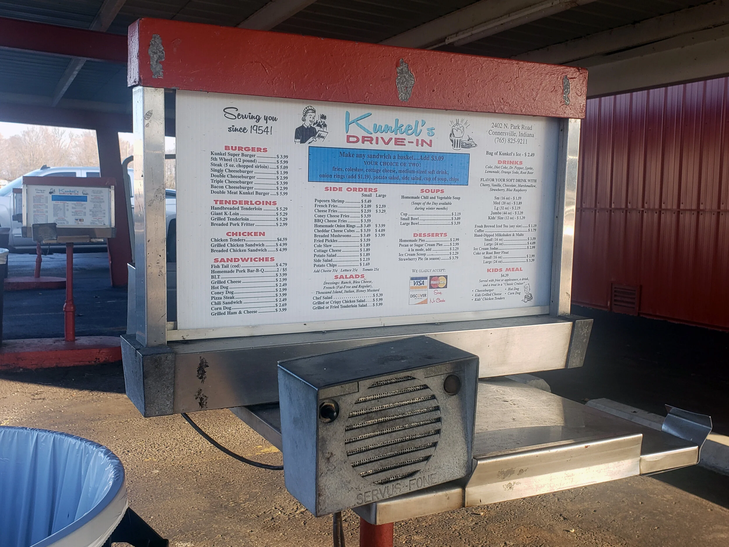
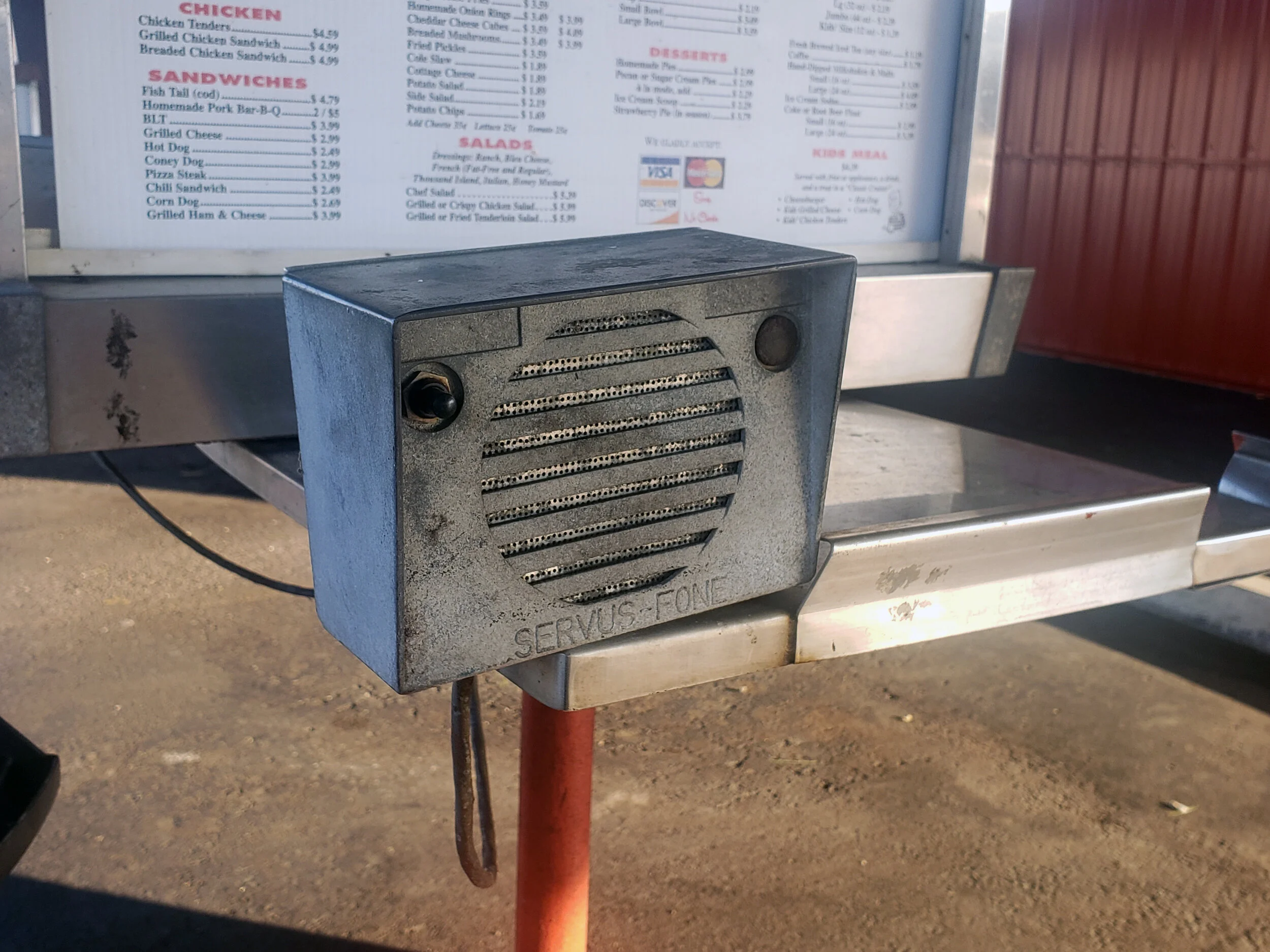
Kunkel’s Drive-In is one of the few drive-in diners still in operation in the United States. Located in Connersville Indiana, it has been operating since 1954 and serves the town’s residents quickly and delicious meals. The restaurant is a cultural landmark of the town, as it has hosted car shows since its opening years in the 1950s. The current aesthetic of the restaurant relies on the 1950s retro appeal. Much of the restaurant’s visual qualities have remained the same since its debut in 1954 including the order call boxes on the exterior of the restaurant and the murals painted on the interior walls.
SOLUTION:
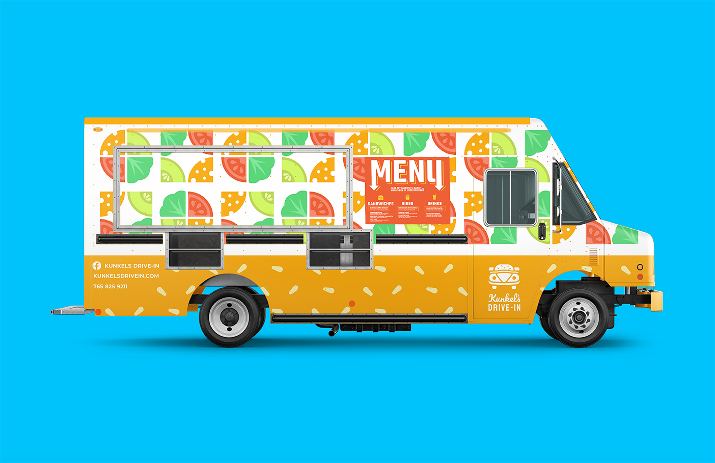
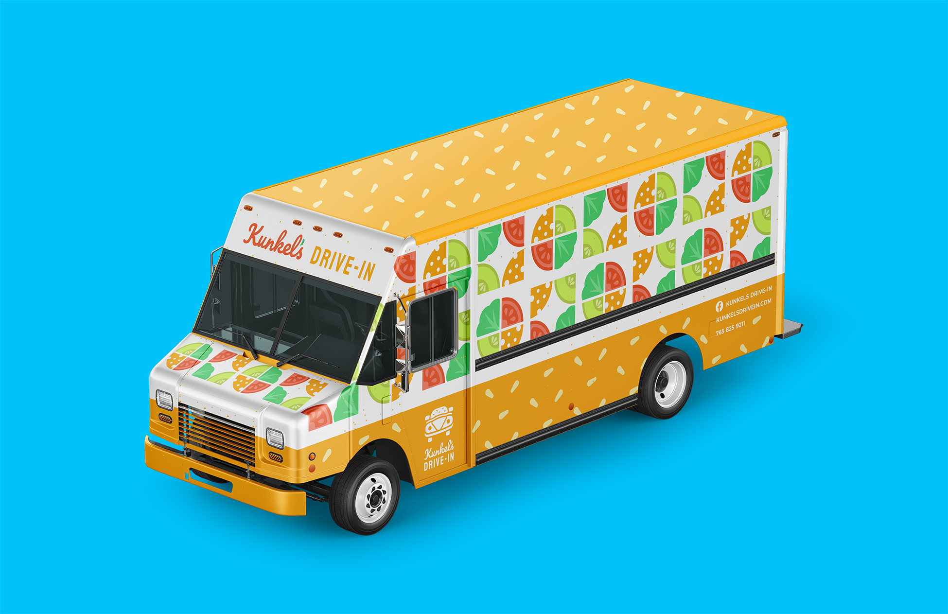
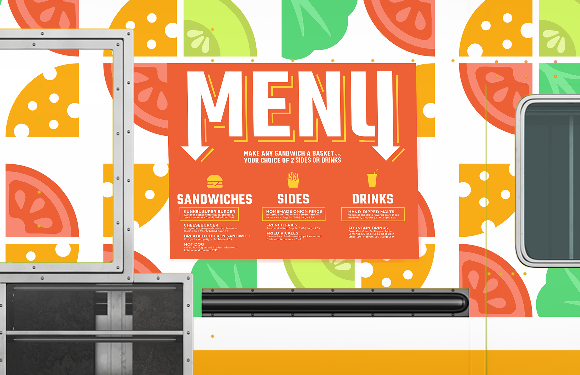
I approached the rebranding of the restaurant in a way that sought to preserve the charm of the 1950s while making the overall design more cohesive and accessible. The menu was reduced to the restaurant’s best-selling items to make serving from a food truck possible. The design decisions made in the truck and packaging are reminiscent of 1950s mid-century design.
IDENTITY SYSTEM
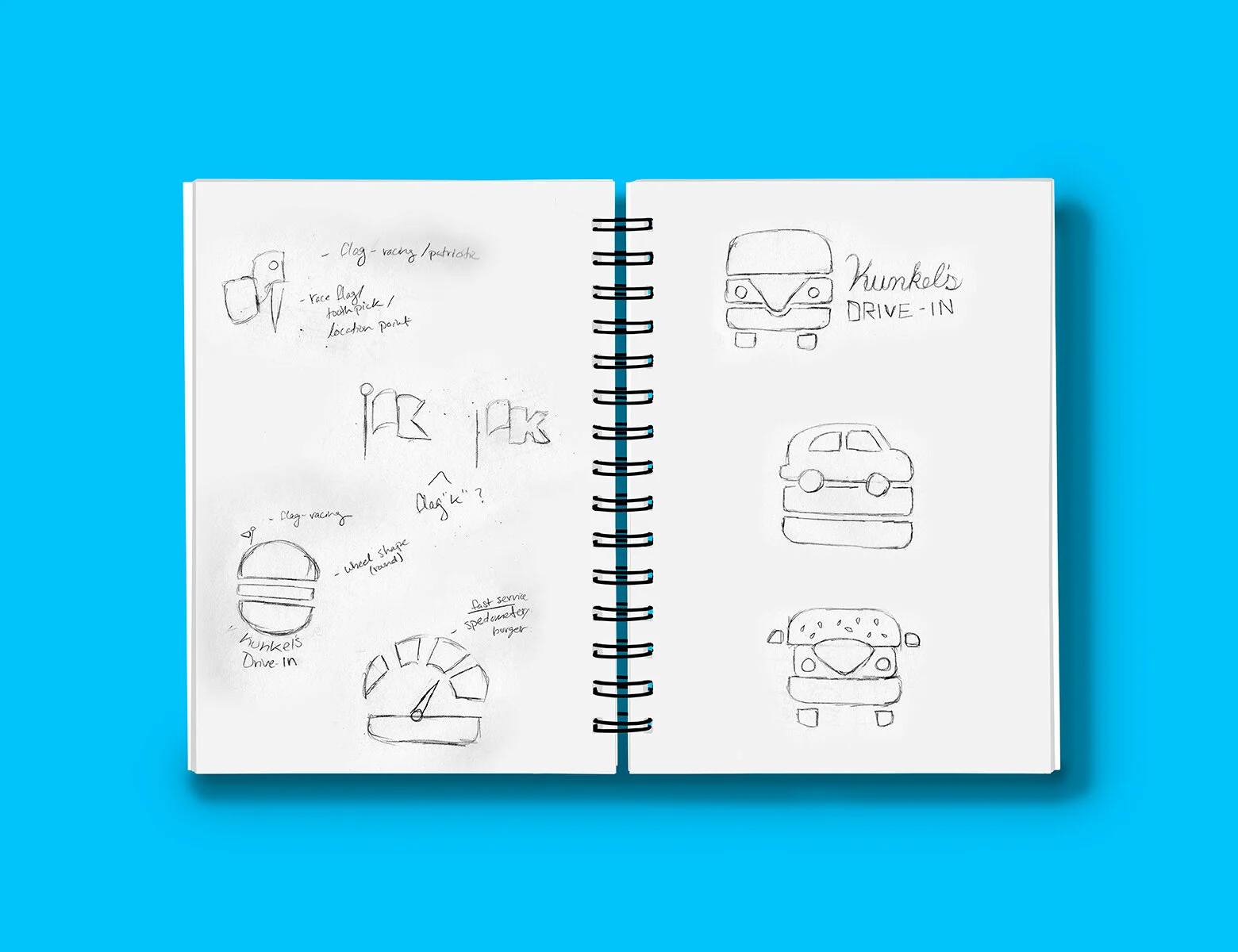
When revising the identity, I chose to combine the two most important cultural appeals of the restaurant: its car shows and classic American cuisine. To do this, I blended the visual qualities of a vintage Volkswagen Beetle with a cheeseburger into a single logomark. I chose typography that references the script font they currently use for ‘Kunkel’s’ and a geometric font for ‘Drive-In’. The latter is a reference to the neon signs common on highways during the 1950s to indicate food or motel locations.

Logomark
Vertical Logo
Horizontal Logo
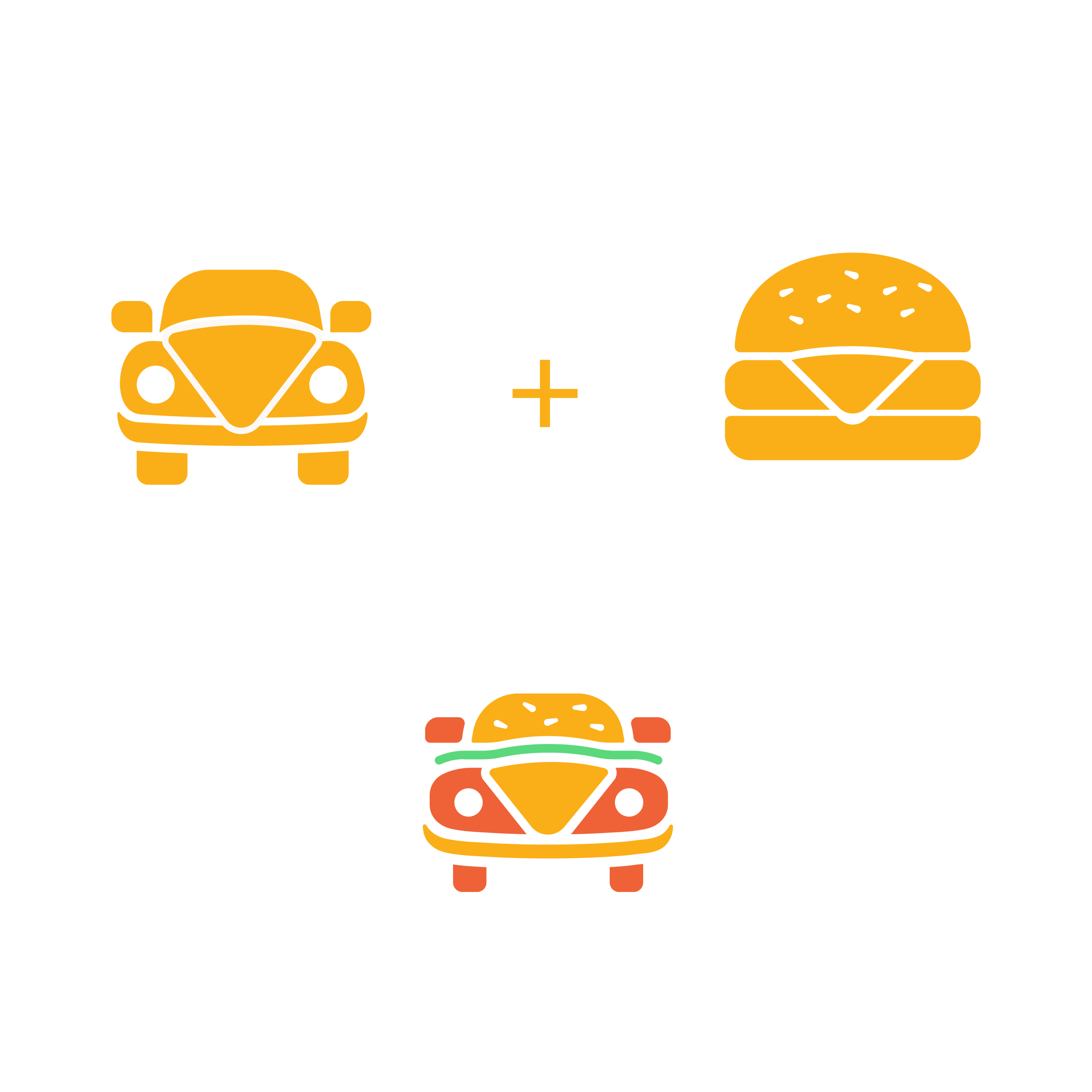
Logo Concept

Pattern
FOOD TRUCK
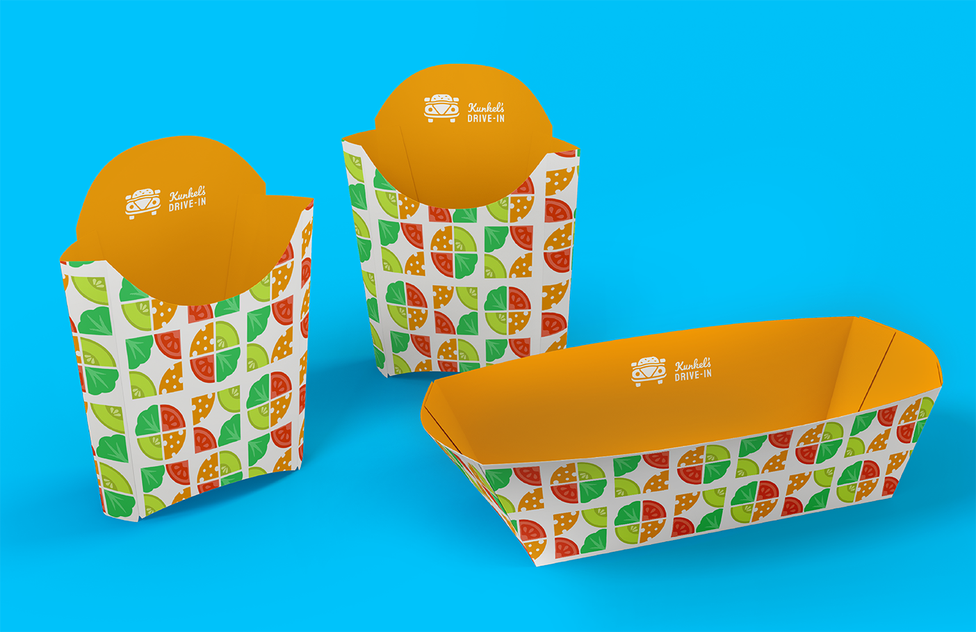
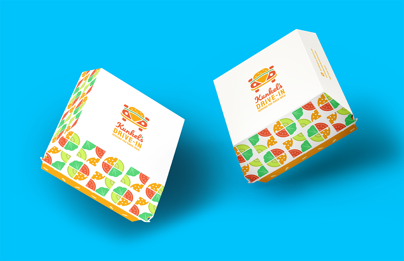
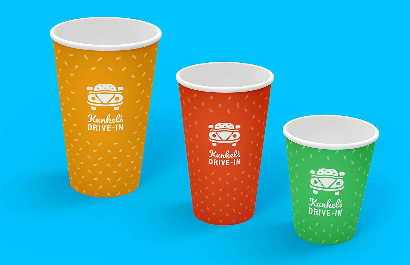
The packaging and the truck features a pattern reminiscent of 1950s mid-century design while also offering a modern color palette based on burger ingredients. Most of the colors are warm tones intentionally chosen to trigger an emotional, hungry response in the viewer.
MENU ENGINEERING
PACKAGING
